Pantone Announce 2016 Colour of the Year
Every year Pantone, the designer’s equivalent of ‘the Bible’, announces their favourite colour for the coming year. More about Pantone, or PMS (Pantone Matching System), is explained in the Design and Printing Acronyms.
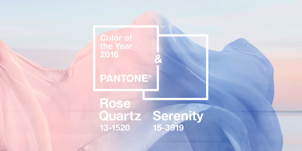
Previously Pantone have named colours such as Marsala (a naturally robust and earthy wine red), Radiant Orchid (an expressive, creative and embracing purple) and Emerald (a lively, radiant, lush green). But in 2016 there’s a twist, for the first time Pantone has named two colours of the year!
Rose Quartz is a persuasive yet gentle tone that conveys compassion and a sense of composure. Serenity is weightless and airy, like the expanse of the blue sky above us, bringing feelings of respite and relaxation even in turbulent times.
Rose Quartz and Serenity are the colours to watch after the new years break but Pantone have kicked off the celebrations early with various graffitied walls in the colour combination.
Muralist @w3rc created this spectacular surreal take on Pantone #ColoroftheYear 2016 #RoseQuartz & #Serenity. #HellsKitchen #NYC #Werc #Pantone A photo posted by PANTONE (@pantone) on
Let's start a conversation
Contact us today if you have any questions or would like to start the journey. Our friendly and experienced team are here to help!